Note: High resolution images of some of the following photos are available. These photos are marked with [HiRes] tags in their captions. Click on the photos to view their higher resolution images.
Didn't expect to see another ambigram from me after my last one? Well not me, but I surely didn't see one coming so soon.
My last ambigram described in that post is this.
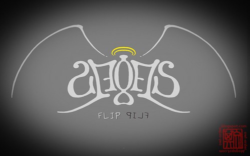
I was so pleased with this ambigram that I edited it further.
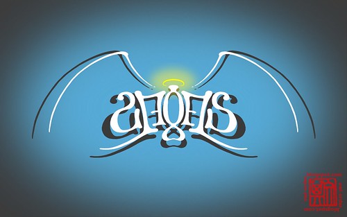
[HiRes] Version 2. Notice the redid halo.
Even after reaching V2, I was still interested in pushing GIMP a little further. This is the result.
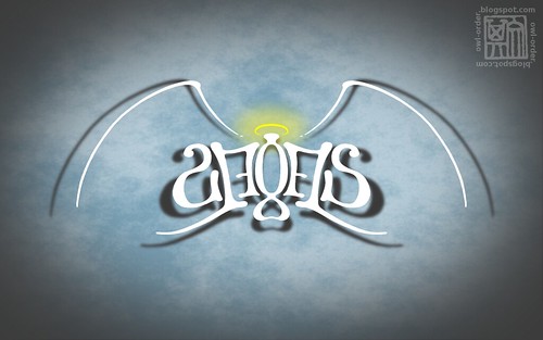
[HiRes] Version 2.1, my current Linux wallpaper. It's called "desktop background" instead of wallpaper in GNOME, actually.
And I was finally satisfied.
But less than a week after that, I designed yet another ambigram. I volunteered to design an emblem (or banner) for my team in a game called Utopia, and one day, when I was bored in class (again), I started doodling our team name.

[HiRes] The first draft. Note how I tried to match the different letters of the two words on the top left corner, and the designs I considered for the final letter (e upright, s reflected).
I originally designed it curved, but immediately realised the challenge in mirroring a curved surface using a computer (I normally snap a photo of my designs to digitise them). I then redrew the design, this time straight. I could simply reflect the ambigram before curving it digitally, if at all.

[HiRes] The many drafts after the first.
As mentioned, I normally take a photo of the drafts and do fine editing with GIMP. But the whole process took too long that night and I got fed up. The result wasn't too satisfying too. This obviously isn't the professional way of doing it -- painting with brush and paper is simply easier than pixel-by-pixel editing. I knew I had to try something else.
So I stripped the entire design down to consist only of horizontal and vertical lines, curves (all of a single common radius), and one single diagonal, shown at the bottom right of the picture above. I then digitally drew a long horizontal line, a vertical line, and a single curve, which were easy. Then, referring to my draft, I copied the lines and curve, pasted them, and arranged them into a digital version of the ambigram. For the diagonal, I simply copied a horizontal and rotated it.
Not long after that, this came out.

[HiRes] Version 1.
I wasn't really happy with it that night. I thought the words were illegible, the design too digital and the lines too solid. But until I obtain the required skills and tools to produce more professional-looking ambigrams, this may be the best I could do. I posted it to Flickr and informed my team mates about it and went to bed.
The next day, I received feedback from my team mates -- while they weren't exactly crazy about it, they accepted it more readily than I did. After taking another look at V1, I changed my view on the design. It wasn't so bad after all -- all of the letters were quite convincingly transformed, even the harder ones (except perhaps the first L of the second word), and both words can be read quite effortlessly. The reflection was simple, but iPhone-ish classy. They were reasonably long words, and I didn't have a say on them (someone else decided on them) which made the achievement even greater.
I then gave it a makeover, coming up with several different images with slight tweaks.

[HiRes] Version 1.01. By skewing the reflection, I turned it into shadow instead.

[HiRes] Version 1.02. Gave it a white second layer because I thought the text of V1.01 was a little hard to read.

[HiRes] Version 1.03. Toggled the colours of the front and back layers for more contrast.
And finally, I can rest my pen (or mouse, more like), for V1.02 and V1.03 look real good for my standards. So good that if it were designed by someone else my age, I would have seen him as a genius.

Version 1.02 in the Utopia game.
OK, I don't see myself publishing new ambigrams again, at least for the next couple of months.
Or so I think for now.


i dont know if its me only... but i only saw the word illusion at the end of the post when u wrote it..
ReplyDeleteanyhow, well done :D
you did? hmmmz. been trying hard to avoid typing either word, even now haha. both words appear as tooltips of the Flickr images, though.
ReplyDeleteand yeah i have to say, the first word is harder to read in the final design. not on the drafts though. that's just IMO